
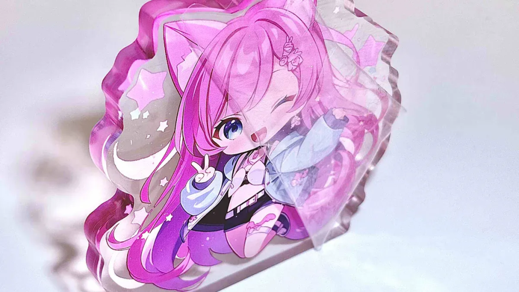
You want your custom-standee, cartoon-keyring, or football-shirt-keyring to look vibrant and professional, whether for gifts-souvenirs or as a keychain-bag-pendant. Acrylic artwork preparation helps you avoid common issues and achieve crisp, clear results. As a beginner artist, you may feel unsure, but the process stays simple if you follow a few key steps:
- Work at 300 DPI for sharp details.
- Choose CMYK color mode for accurate prints.
- Use lossless file formats for best quality.
Yakelike supports beginners through every step, making your creative ideas shine.
Key Takeaways
- Set your digital canvas to 300 DPI for sharp and clear prints.
- Use CMYK color mode to ensure accurate color matching in your final product.
- Choose lossless file formats like PNG or vector formats like AI for the best quality.
- Add a bleed area of 2-3 mm to prevent white edges after cutting your acrylic products.
- Double-check your artwork files for details and communicate clearly with your manufacturer for the best results.
Acrylic Artwork Preparation Basics
Why Preparation Matters
When you prepare your artwork files for acrylic products, you make sure your designs look just as you imagine. Acrylic printing uses unique materials that can show off transparency and depth. If you use generic print files, you might lose important details or see unexpected color changes.
Preparing artwork files specifically for acrylic products ensures the final print matches your vision, keeps colors true, and creates the visual effects you want. Generic files may not work well with acrylic’s special qualities, like transparency and depth, which can change how your art appears.
Acrylic artwork preparation helps you get the best results. You can explore effects like partial transparency, which makes your keychains and standees stand out. Using the right file formats, such as PNG, also helps keep your designs crisp and clear.
Key Steps Overview
Yakelike, as a professional manufacturer, guides you through each step of acrylic artwork preparation. You do not need to feel overwhelmed, even if you are new to this process. Here are some practical steps to follow:
- Set up your digital canvas at 300 DPI for sharp, detailed prints.
- Use CMYK color mode to match print colors closely.
- Choose file formats like PNG or PSD for the best quality.
- Make sure your design has a transparent background if you want see-through areas.
- Add clear outlines and cutting lines to show where your product will be cut.
- Leave a small bleed area to avoid white edges after cutting.
- Double-check your file before sending it to Yakelike.
If you have questions, Yakelike’s team can help you at every stage. Many beginners ask about the right supplies, surfaces, and how to set up their files. You can always reach out for advice to make your acrylic merchandise look professional.
File Format & Resolution
Recommended File Types
Choosing the right file format is a crucial step in acrylic artwork preparation. You want your designs to print with sharp lines and vibrant colors. Different file types serve different purposes in the production process. Here is a table that shows the most widely accepted formats for custom acrylic keychains and standees:
| Format | Description | Preferred? |
|---|---|---|
.STP / .STEP | Universal 3D CAD format, CNC-ready | ✅ Best |
.DXF / .DWG | CNC laser cutting, panel layout | ✅ |
.AI / .EPS | Vector artwork for UV print, cutting, graphics | ✅ |
.PDF (with size) | Quoting, dieline reviews, basic artwork | ✅ Initial |
You should use vector formats like AI or EPS for designs that need precise cutting or scaling. These formats keep your lines crisp at any size. For simple artwork or initial reviews, PDF files work well if you include the correct size. If you plan to create 3D or layered effects, STEP or DXF files help manufacturers like Yakelike process your order smoothly.
Tip: Always check with your manufacturer for their preferred file type. This helps avoid delays and ensures your artwork prints exactly as you expect.
Setting Resolution for Print
Resolution determines how clear and detailed your printed acrylic product will look. You measure resolution in DPI, or dots per inch. Higher DPI means more detail and sharper images. Here is a table to help you choose the right resolution for your project:
| Resolution (DPI) | Description |
|---|---|
| 300 DPI | Industry standard for clear printing |
| 600 DPI | Recommended for smaller keychains to capture minute details |
| Low DPI (72 or 150) | Often leads to pixelation and poor visual quality |
You should always set your canvas to at least 300 DPI before you start designing. This setting gives you crisp lines and smooth color transitions. For very small items, like mini keychains, 600 DPI can capture even the tiniest details. Avoid using low-resolution images. These often look blurry or pixelated when printed on acrylic.
High-resolution images lead to prints that show remarkable depth and clarity on acrylic. The resolution of your image directly affects the visual quality of your final product. If you want your keychains and standees to stand out, start with a high-resolution file.
Note: Once you finish your design, zoom in to 100% or even 200% to check for any blurry edges or pixelation. Fix these issues before you export your file for printing.
Maintaining image clarity is essential for professional results. Save your files in the correct format and resolution. This step ensures your acrylic merchandise looks as vibrant and detailed as your original artwork.
Design Tips for Acrylic Products
Transparent Backgrounds
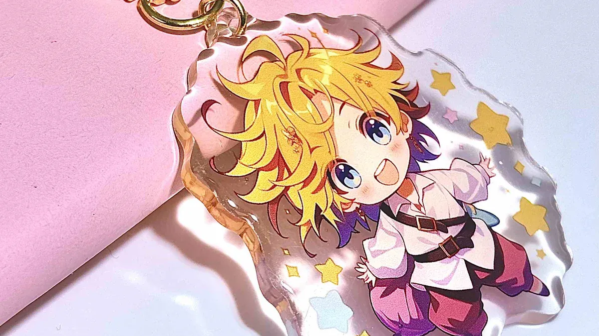
When you design for acrylic keychains and standees, always use a transparent background. This step ensures your final product prints correctly and looks professional. If you use a solid background, you might see unwanted white or colored edges after cutting. Transparent backgrounds help your design blend smoothly with the acrylic, making the finished piece look clean and polished.
- Transparent backgrounds keep your artwork looking sharp.
- They prevent unwanted borders around your design.
- You achieve a more professional appearance for your merchandise.
Cutting Lines & Bleed
You need to create clear outlines and cutting lines in your digital artwork. These lines show where the manufacturer will cut the acrylic. Use vector graphic software to draw precise paths. For best results, add a bleed area of two to three millimeters beyond the intended cut line. This extra space prevents edge issues and ensures no unprinted gaps appear after cutting.
- CNC routers and laser cutting machines follow your digital cutting lines for accuracy.
- Hand tools can also create clean cuts if you guide them along marked lines.
- Always include a bleed area of 2–3 mm to avoid white edges.
Tip: Use a separate layer for your cutting line and label it clearly. This helps the manufacturer understand your design and reduces mistakes.
Color Choices
Choosing the right colors makes your acrylic merchandise stand out. Acrylic prints deliver unmatched vibrancy, which helps your designs look visually appealing. Use the CMYK color model for accurate printing. This model matches the colors you see on your screen with the final printed product.
| Color Model | Strengths | Weaknesses |
|---|---|---|
| RGB | Vibrant and wide range of colors suitable for digital displays. Better for web and screen content. | Limited for print; color shifts may occur when converting to CMYK. |
| CMYK | Accurate printing for physical media. Standard for commercial printing, ensuring accurate color output. | Limited color range compared to RGB, cannot reproduce some vibrant colors. |
White ink printing can enhance the visibility of your logos and designs, especially on darker acrylic backgrounds. High-end printing techniques provide exceptional clarity, depth, and vibrancy, making your visuals stand out. When you follow these color tips as part of your acrylic artwork preparation, you help ensure your finished products look their best.
Preparing a Canvas for Digital Art
Using Gesso as an Analogy
When you start a painting, you often use gesso to prepare your canvas. Gesso creates a smooth, even surface that helps paint stick and colors stay bright. In digital art, preparing a canvas works the same way. You do not use real gesso, but you still need to get your digital file ready for printing. Think of the steps you take to prime my canvas in traditional art. You want your digital artwork to have the best surface for printing on acrylic keychains and standees.
How to Prime My Canvas Digitally
You can follow a simple process to prime my canvas in your digital art program. This process helps your artwork print clearly and look professional. Here are the key steps for preparing a canvas for acrylic printing:
- Set your canvas size to match the final product. For a two-inch keychain, use at least 600 pixels wide.
- Choose 300 DPI for your resolution. This setting keeps your details sharp.
- Work in CMYK color mode. This mode gives you the most accurate print colors.
- Add a bleed area of two to three millimeters beyond the cut line. This prevents white edges.
- Use vector files when possible for crisp lines and easy scaling.
Just like you would use gesso to seal and smooth a real canvas, these steps help you prime my canvas digitally. You avoid problems like color distortion or blurry edges.
Canvas Setup for Acrylic Merchandise
Preparing a canvas for acrylic merchandise means checking every detail before you send your file to print. Use this checklist:
- 300 DPI resolution
- CMYK color mode
- Proper bleed and safe area
- Vector or high-resolution raster files
Preparing a canvas with care ensures your acrylic keychains and standees look vibrant and professional. Treat your digital file as you would a real canvas—prime my canvas, check your settings, and your artwork will shine.
Export & Submit Artwork
Print Compatibility Check
Before you send your artwork to Yakelike, you need to make sure your files are compatible with acrylic printing. Many artists run into common problems during this stage. You should always outline or embed your fonts to prevent text from changing or displaying incorrectly. Mark the print direction clearly so your design does not get assembled the wrong way. Color mismatch can happen because of different print settings or materials. You can reduce this risk by confirming color references or requesting a physical sample.
| Common Problem | Possible Cause | How to Reduce Risk |
|---|---|---|
| Color mismatch | Different sheet batches, lighting, print setup | Confirm physical samples and references |
File Export Steps
You want your artwork to print exactly as you designed it. Follow this step-by-step guide to export your files correctly:
- Use a modern PDF standard for exporting your artwork.
- Set the export standard to PDF/X-4:2010 for best results.
- Choose compatibility with Acrobat 7 (PDF 1.6).
- Outline all fonts and flatten transparency if possible.
- Save your file in accepted formats like PDF, AI, DXF, or CAD.
- Double-check for white lines caused by flattening; these usually do not appear in the final print.
Before you submit, use this step-by-step guide to review your file:
- Check resolution, fine lines, and text.
- Verify opaque and transparent areas.
- Confirm cutline shape, rounded corners, and hole positions.
- Review hardware and packaging details.
A careful step-by-step guide helps you avoid mistakes and ensures your acrylic keychains and standees look professional.
Communicating with Yakelike
When you submit your artwork, include any special requests or instructions. You can specify hardware choices, packaging preferences, or ask for a sample. Clear communication helps Yakelike understand your vision and deliver the best results. Always double-check your files before sending them. If you have questions, reach out to Yakelike’s support team for guidance. They can help you resolve any issues and make sure your custom acrylic products turn out just right.
Tip: Taking time to review your files and communicate your needs leads to a smooth production process and high-quality merchandise.
You can prepare your artwork for custom acrylic keychains and standees by following clear steps. Set up your file, choose the right colors, and check your details. When you work with Yakelike, you get more than just manufacturing:
- You can customize your merchandise to match your vision.
- You use eco-friendly options for a sustainable product.
- You receive marketing tips to help your designs reach more people.
Start your creative journey today and turn your ideas into unique acrylic products.
FAQ
What file format should I use for my acrylic keychain artwork?
You should use vector formats like AI or EPS for sharp lines. PNG works well for transparent backgrounds. Yakelike accepts PDF, DXF, and CAD files. Always check the manufacturer’s preferred format before submitting.
How do I make sure my colors print accurately?
Set your artwork to CMYK color mode. This matches print colors closely. Request a sample if you want to see the exact color output. Avoid using RGB for print designs.
Do I need to add a bleed area to my design?
Yes. Add a bleed area of 2–3 mm beyond your cut line. This prevents white edges after cutting. Bleed ensures your artwork covers the entire product surface.
Can I include text in my acrylic merchandise design?
You can include text. Outline or embed your fonts before exporting. This keeps your text looking correct and prevents font changes during printing.
