
Why Acrylic Keychain Thickness Changes How Your Design Looks
Many people assume acrylic keychain thickness only affects how heavy a keychain feels.
In reality, thickness also plays an important role in how a design appears once it’s printed and finished.
Understanding this difference helps explain why the same artwork can look noticeably better on one acrylic keychain than another.
Thickness Affects Light, Not Just Weight
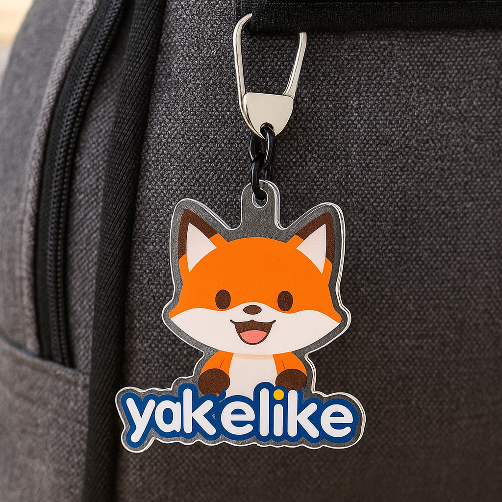
Acrylic is a transparent material, which means light passes through it.
When acrylic is thicker, light interacts with the printed surface differently—often making colors appear deeper and edges look cleaner.
This is especially noticeable in designs with fine lines, layered colors, or darker tones.
Thicker Acrylic Helps Protect Printed Details
Another factor is durability.
With thicker acrylic, printed designs are better protected from daily friction, key movement, and surface wear. Over time, this helps the artwork maintain clarity instead of fading or looking dull.
That’s one reason thicker acrylic is often chosen for merchandise, artist designs, and branded keychains meant for long-term use.
Thickness Influences the Overall Perceived Quality
People often describe thicker acrylic keychains as “more premium,” even when they can’t immediately explain why.
This perception comes from a combination of visual depth, edge polish, and how the piece feels when handled.
Design choices that seem small during production can strongly influence how finished products are judged.

Final Thought
Acrylic thickness is more than a technical detail—it shapes how a design is seen, felt, and remembered.
Understanding these differences allows creators and brands to make more intentional design decisions, rather than relying on guesswork.